rebranding SsangYong to KGM
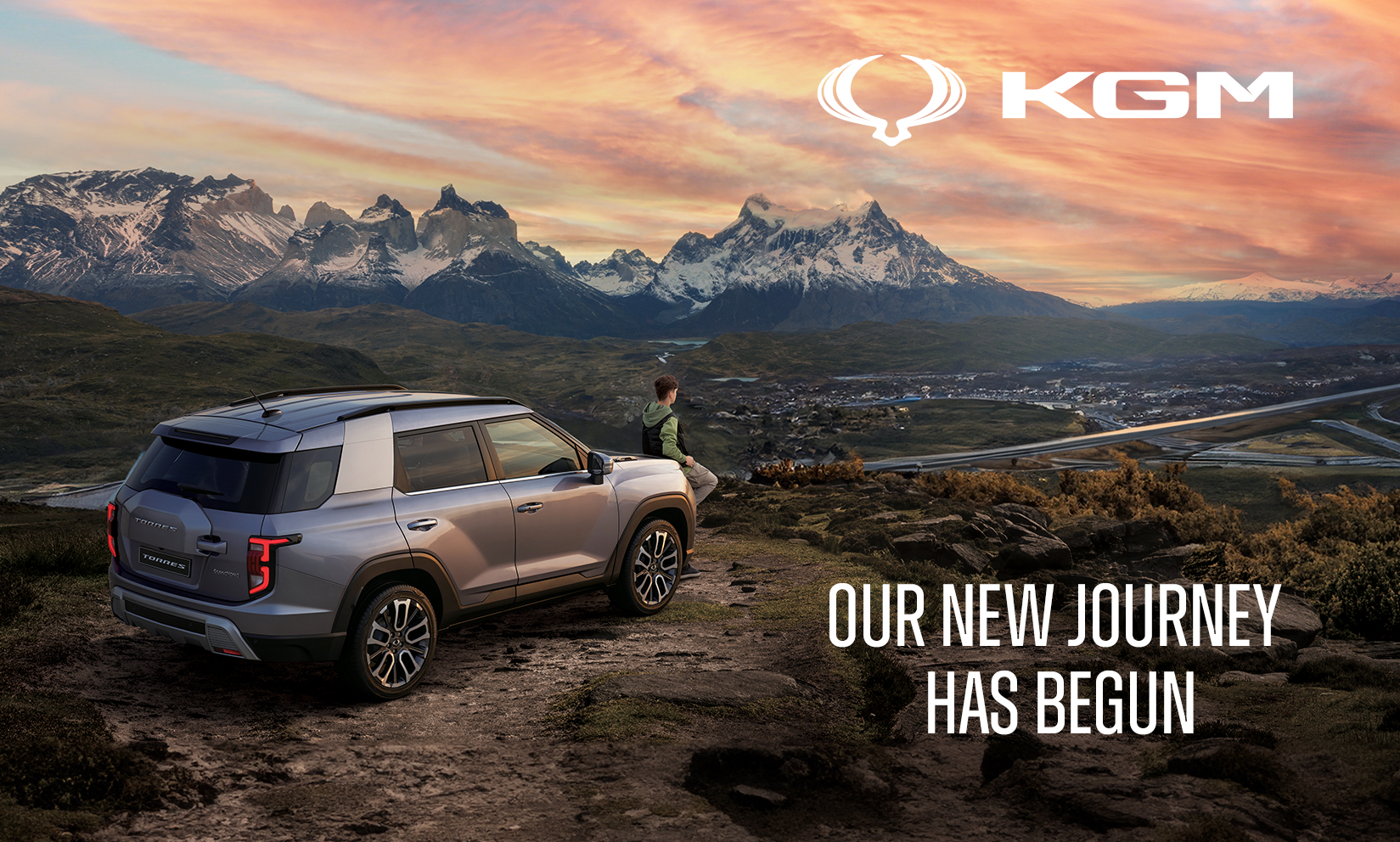
Our New Journey Has Begun
Visarc has been working with KGM (formerly SsangYong) for several years supporting the brand to deliver a host of successful integrated marketing campaigns in the UK. Towards the end of 2023 the company approached us with a new brief, to help them to deliver a complete rebrand!
SsangYong was acquired in 2022 by KG Global, a large conglomerate also headquartered in South Korea. One of the outcomes of this acquisition was that the SsangYong name would be replaced by KG Mobility on an international level, necessitating a complete overhaul of corporate identity.
website rebranded
items of collateral rebranded
dealerships transitioning
challenge
Considerable forethought is required when making changes to automotive branding due to the sheer number of applications required. From boot badges to showroom signage, websites to sales invoices the scale and mediums vary significantly. So one of the first things our team sought to confirm with the client was how the name change would affect the vehicles shipped to the UK market, as that was something we had limited control over.
After participating in various conversations and workshops, it became clear that the original “Dragon Wings” brandmark would still be applied to the steering wheels of all models. It was also confirmed that in the UK and other parts of Europe, the company would be known as KGM rather than KG Mobility. This decision brought with it multiple benefits from a design perspective, and avoided the sometimes confusing connotations that “mobility” has in the UK market.
Having confirmed the technical parameters we needed to work within, we refined the brief with the client over a number of sessions reviewing touchpoints across the customer journey and drawing out themes from previous creative executions. Key points raised included the need for more breathing space around the brandmark, whilst calls to action and key messages needed to be more succinct and the images of the new model line up needed to shine through and take centre stage.
Collectively it was agreed that the concepts and creative routes we would go on to develop needed to show a KGM brand identity that inspired confidence, the quality of the product being apparent and not needing embellishment or over explanation. Next step, over to the studio.
approach
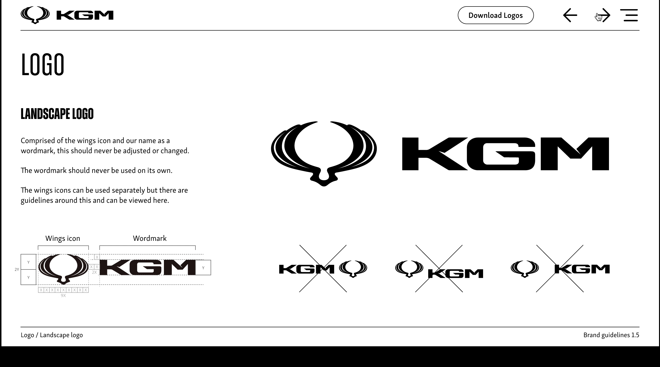
Development of the Wordmark and Logo Lockup
With the clear direction that the Dragon Wings would be carried over to the new models being produced, the development of the new wordmark and overall Logo lockups could get underway.
Our creative team played with the scale and distances of the elements as well as some other visual cues.
In the end, we arrived at a logo lockup that would form one of the key pillars of the rebrand.
font selection
Before the rebrand, one of the SsangYong brand elements that we had experienced challenges with was the body text font, Antenna, particularly when using numbers. These numbers had varying baselines which mean that when they were implemented in body copy, they could sometimes look messy would often disrupt the design and make the text harder to read.
We explored varying font pairings that would work across a variety of settings from body copy to headlines whilst also looking at their relationship with the new KGM logo lockup. We settled on a two-font combination that could be used in multiple digital projects whilst also being able to be applied to printed items. One font was clean and simple allowing for it to be easily read at every font size, whilst the other worked as a headline font that sat comfortably with the wordmark and worked well at a variety of weights. This pairing enabled us to create a messaging hierarchy in any body of test without the need to introduce other graphical elements.
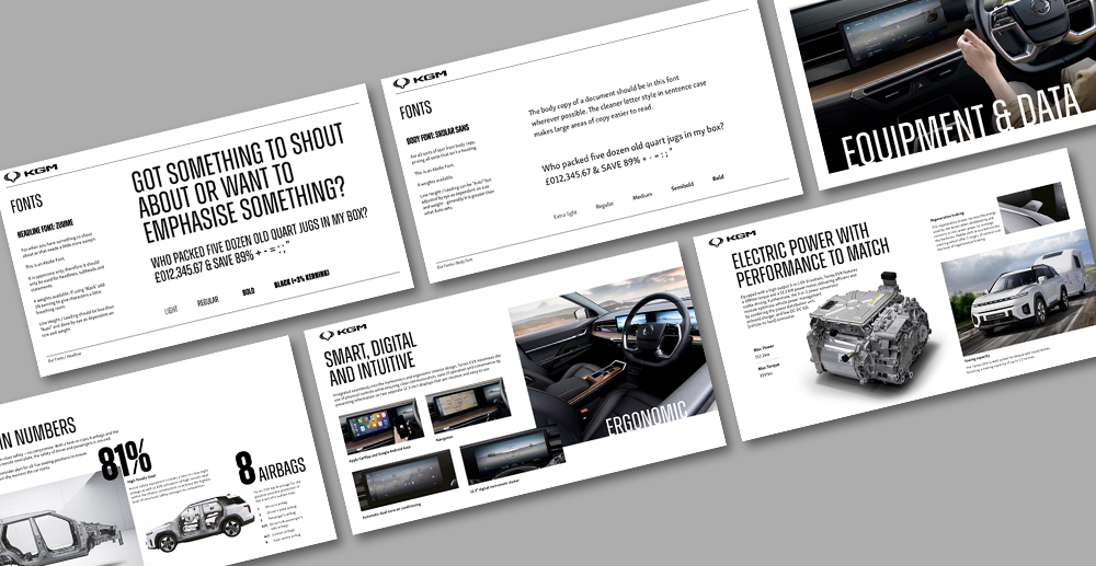
colour palette
A conscious decision was made to keep the colour palette to a minimum to allow the vehicle imagery to take centre stage. The use of black and white gave us the opportunity to create a more contemporary look. We also added a regal purple palette as used by the KG Global branding to give reference when appropriate. This tone would be used sparingly and subtly when it was right to do so, for example, in the mood lighting of interior product photography, in icons or in the hue of illuminated signage.
live feedback loop
As is often the way with commercial branding projects, we had multiple deadlines to meet that coincided with each other. One such deadline was the need to deliver a complete website redesign, which would enable a wider build process to commence.
This meant that some of the core building blocks that express the brand came as a result of the website design process. A clean and functional style developed where negative space was encouraged, and unnecessary content was removed. To-the-point copy brings imagery to the fore, and a less cluttered aesthetic allows calls to action to be more visible.
The same theory was then applied to brochures, spec sheets and email templates. The benefit of designing multiple items meant that we could progress and adapt the design principles based on the specific needs of each output. This led to the creation of a range of durable building blocks and visual devices which work across mediums, delivering a familiar look and feel.
“The acquisition of SsangYong in 2023 by KG Global not only brought with it a name change but also significant investment in a new model line up featuring an exciting new design language. SsangYong has always offered value-centric vehicles to the UK market, but was not previously regarded as a maker of a design-led range of cars, that has all changed. With that in mind we set out to construct a very structured and striking brand that focused on the products. We aimed to break down the barriers and the perceptions often associated with a challenger brand in the automotive industry. So far, the signs are promising, with results to date being very positive.”
andy redman, head of creative, Visarc
brand guidelines
As we worked our way through a range of deliverables, we were able to explore design concepts and creative ideas intended to push boundaries. Some worked better than others whilst a few were kept back for further campaign work.
Due to this experimentation, we were able to develop a set of ground rules as to how the branding should be applied, these evolved into a series of brand guidelines. As with many brand rule books, we started with the essentials that would be needed for all outputs – this included logo variations, fonts, colours and basic imagery rules. Rather than use the classic PDF format and continually distribute a replacement with each update, we developed a live digital version which could be updated easily and reduce the risk of out-of-date guidelines being used.
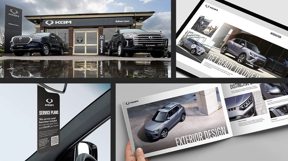
We then developed extensions to the core guidelines, including dealership signage. Each dealership was likely to have very different needs, so we developed a guide that had flexibility at its core. By keeping items simple and using our contrasting colour palette we were able to ensure that the brand would stand out in a variety of applications.
result
We have received extremely positive feedback regarding the output. Backing up this sense of a job well done, we have seen positive commercial indicators since the rebrand was implemented, particularly across digital channels. The 2024 KGM model year has had some striking new products reaching the market which has also contributed to the successful launch of the new branding. KGM and our creative team worked extremely hard to deliver a brand architecture that is capable of communicating the essence of a brand reborn. A new journey has begun and if the destination is as rewarding as the experience so far, our team will be very happy.
get in touch
get in touch with us and discuss your next project