Rako's lifestyle orientated brochure resonates with target customers
Rako is a UK-based designer and manufacturer of smart lighting controls that supplies both the commercial and residential sectors. Established more than 20 years ago, the brand is at the forefront of smart automation for lighting controls and window treatments. We are Rako's dedicated marketing agency, providing print design solutions, 3D animation expertise, and web design and development.
Following the successful design and production of Rako's product range brochure in 2012, Visarc was tasked with creating a new version which needed to reflect what had changed at the business over the intervening years.
challenge
Over recent years Rako has gone from strength-to-strength, expanding both its product range and sales numbers. A key driver of this growth has been the connections it has built with lighting consultants and other specifiers across the construction industry. These clients value the almost limitless flexibility of the Rako system, the quality of the products, the personalisation available, and the responsive pre-sales and after-sales customer service offered.
Our brief from Rako, was to capture the essence of their current offering. The new brochure should not just function as a product catalogue but demonstrate the range of projects that Rako systems have been installed in and provide coffee table-style inspiration for future designs. The brand also wanted to convey its commitment to sustainability, not just through the materials used to make the brochure, but through its messaging.
approach
design
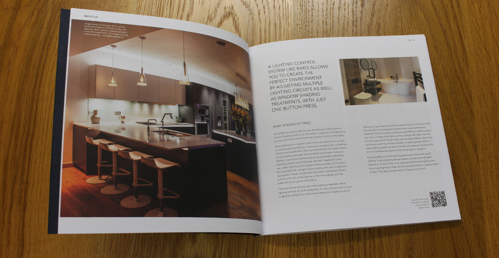
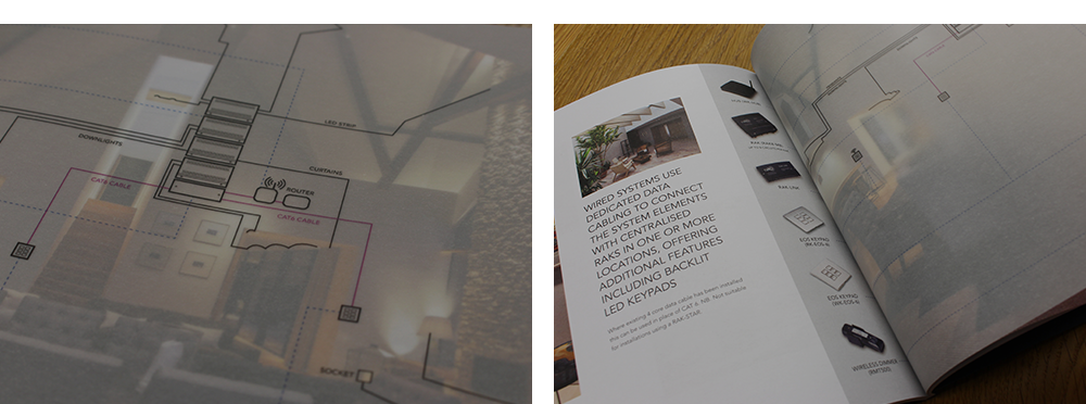
In the planning and ideation stages of the project it became clear that there was a need to pair back the design of the new brochure versus what had come before. In keeping with the desire to get in front of architects and lighting consultants, a more muted colour palette was combined with a white background, stronger headings, and a more obvious grid layout to reflect the premium design publications popular with specifiers, such as Icon and Wallpaper. One design element that was carried over from the earlier brochure was the use of semi-transparent overlays (transprint leaves) of system diagrams over the top of the project photographs they relate to. These brings to life the components required to deliver the scene setting superpowers the brand is now famous for.
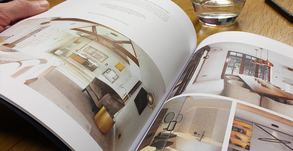
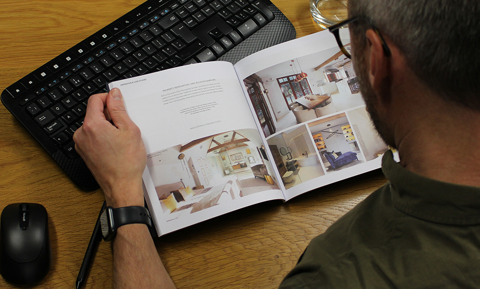
From a content perspective many new pages of case studies were added showcasing Rako installations across hotels, bars, showrooms, and residential properties. Additional space was also added to present the range of finishes available and the matching accessories. This information is important to specifiers, enabling them to create a cohesive finish to their projects.
In an increasingly digital world, it’s always exciting to work on print design projects. The permanence of a physical asset gives a different kind of resonance to the design process. The Rako project in particular required real attention to detail from our experienced team of designers. The effort was worthwhile. The output perfectly balances form and function, just enough content to demonstrate the businesses capabilities, but not so much as to turn it into an unwieldy book. It looks and feels beautiful, a source of inspiration you want to hang on to.
andy redman, head of creative at Visarc
production
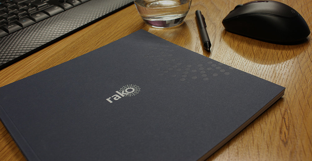
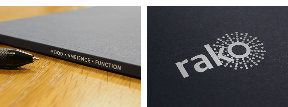
In keeping with the more subtle use of colour and the magazine style layout, the project team decided to go to print with a unique specification. 120gsm 100% recycled stock with a matte finish was used for the main pages. This gave the brochure a substantial feel and naturally softens the colours present in the imagery, adding to a premium feel both visually and in the hand. 150gsm transclear white leaves used for the system diagrams were tipped in at the appropriate point in the page flow.
Special mention is required for the cover. None of us want to admit it, but many brochures end up in the recycling bin. This is unlikely to happen with this one. 270gsm uncoated blue Colorplan stock was applied to the pages using a perfect bind with the cover drawn in. Prior to this, the Rako logo was applied to the cover using a combination of white and grey foil. A final flourish, and what really gives the wow-factor is the artfully placed blind deboss of the Rako spot detail (part of its logo) exactly where you place your fingers as you open the brochure.
copies of the brochure produced
pages of pin-sharp images and engaging copy
result
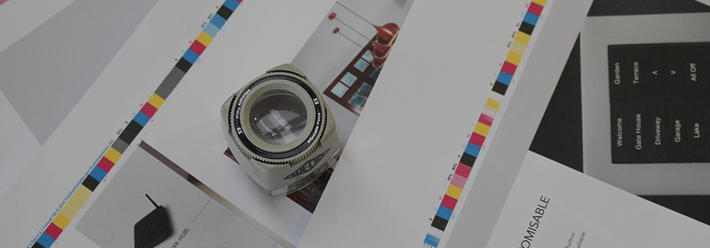
Like many well-considered designs, a great deal of thought and time was involved in delivering something that was both simple and striking. Production of this brochure required rigorous attention to detail, so much so that despite trusting our print partners with our lives, we still attended the production of this design project, watching it all come together on the shop floor, signing off the initial run.
Upon delivery, the new brochure was extremely well received both internally and externally.
In our industry, physical collateral has real value. So it was vitally important that this project delivered something that felt both premium and timeless, and I'm pleased to say it does, thanks to Visarc's art direction services. Our new brochure captures the essence of the Rako brand and what makes it unique. From a content perspective, the case studies demonstrate the flexibility and openness of our system and the fact this it is trusted by some of the most discerning of specifiers. From a look and feel point of view, thanks to the layout and quality of materials, it gives the impression of something that has been planned and crafted with care. That is exactly the approach we take with every project we work on, and what we were aiming to achieve with our new brochure.
peter broome, director at Rako Controls
get in touch
get in touch with us and discuss your next project