Visarc rebrand supports a renewed focus on long term vision
Over the last 6 months Visarc has embarked on its most significant business transformation since it was founded over 20 years ago. To support such ambitious change, we’ve let our creative team loose on a rebrand. After much blood, sweat, and the occasional tear, we’ve arrived at a new look that celebrates both where we’ve come from, and what we stand for now, as we enter the next chapter in the business' development.
Our ongoing strategy is underpinned by ongoing investment in our own brand and reputation. Key members of our team have been tasked with transforming our sales enablement and marketing strategies, which will clearly demonstrate the value we bring to our clients week in week out, and exemplify how our experience, skills and ways of working support brands in delivering against their core marketing objectives.
franc gamberini, managing director at Visarc
how has the brand changed?
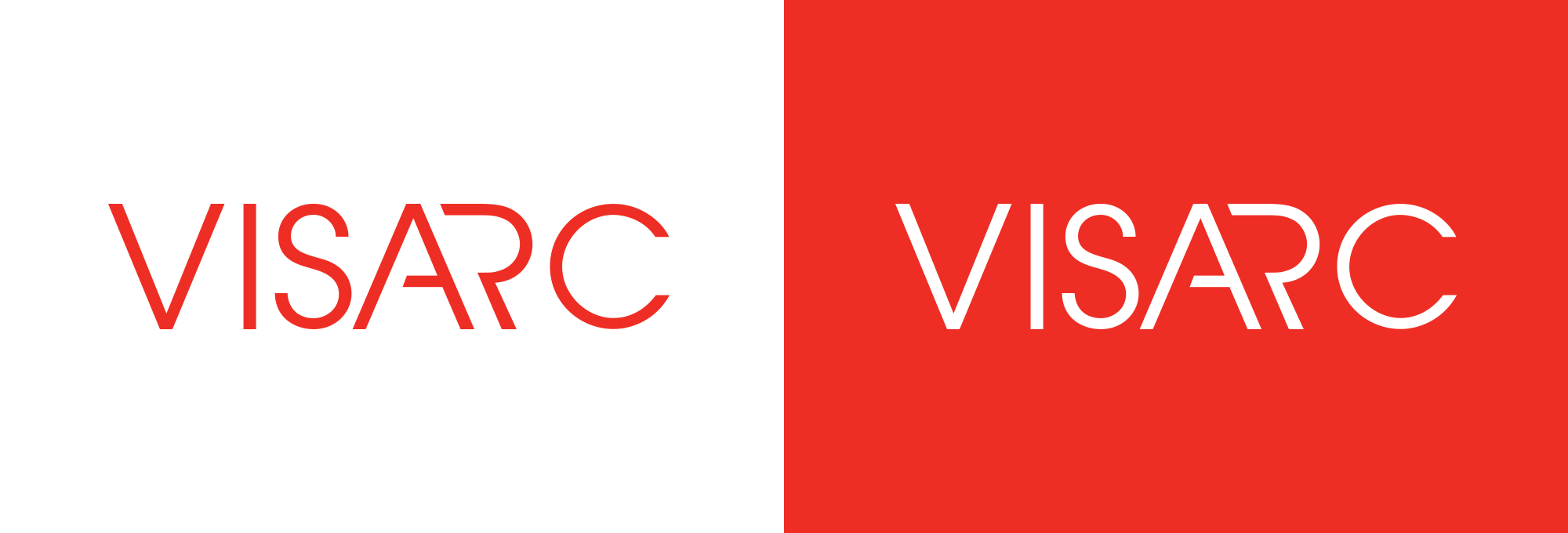
The brief given to our creative team was to explore ways of injecting more personality and openness into the brand, without straying too far away from the clean and professional style which already works well for our business.
the evolution of the Visarc logo/wordmark
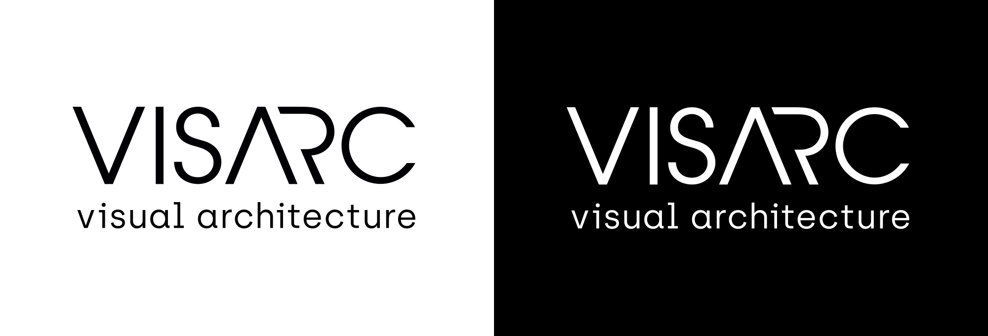
We chose to further develop the company wordmark and its derivative forms rather than start from scratch. The most obvious change is the removal of the A’s bar, whilst we have also adjusted the spacing between individual letters. With a few other minor adaptions, we have modernised the logo without losing its original presence. By adding the strap line, ‘visual architecture’, it means we can communicate the origins of our name too – a thing that has been asked many times.
the flow motif
Injecting a bit of personality into any brand is a fine line to tread. Through a number of exploratory exercises, we felt that the best way for us to soften the quite formal visual cues already in place was to apply additional graphical elements. This led to the creation of the flow motif.
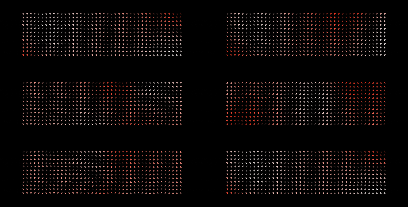
The multi-directional flow motif is derived from the ‘V’ and the ‘A’ in our wordmark logo and the angle brackets that reflect our business' roots in web development. By using these in a repeated pattern with some subtle animations, we can create a number of dynamic and quite beautiful organic forms. These represent our collaborative working environment, and process of moving from an initial brief through to a completed project.
our new colour palette
The Visarc team delivers projects, for a variety of large international brands, our work for them always being the focal point in conversations, presentations, and reports. Recognising this, we took the Visarc red, which tended to dominate our brand assets, and made this more of an accent colour. This enables the overall impression of the brand to be more monochromatic in appearance, allowing our ideas and visuals take centre stage.
typographic changes
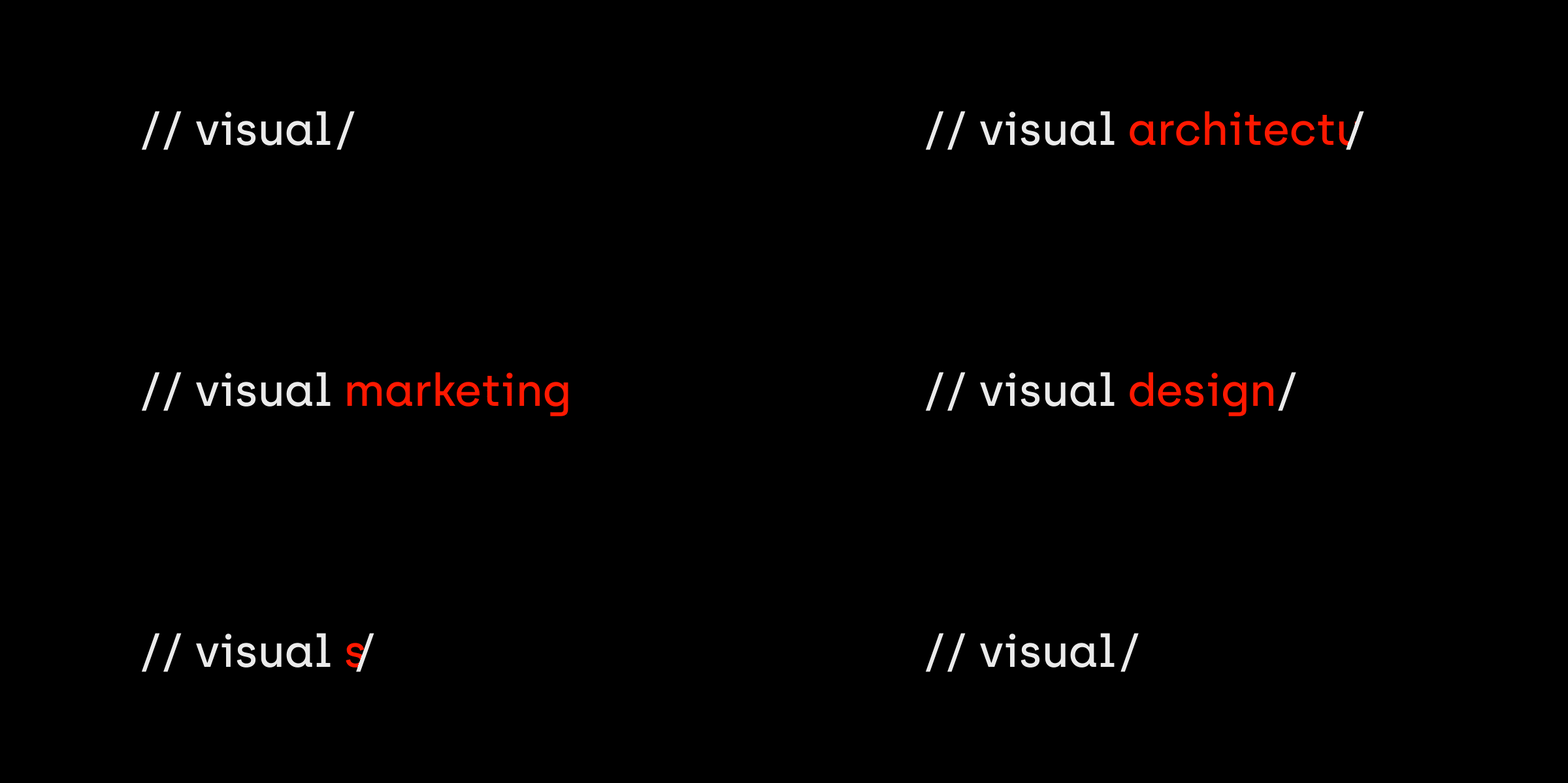
We also took the angles created by the vertical stems in the wordmark to create a double forward slash ”//” element, the forward slash being another character commonly used in coding. This additional brand element can be combined with our accent red to highlight specific headings in web pages or documents. Those headings have also changed, with archia now being used. Archia has a subtle technological feel, with the name itself being derived from the English name Archie, which means genuine and bold, a good fit with our new direction.
what does the Visarc brand stand for?
All Visarc employees and clients have experienced the company’s distinct culture, but up until recently it has never been distilled down to something that can easily be explained. With our renewed focus on growth, and desire to attract the very best talent we’ve now explicitly defined who we are and how we work by selecting 6 core company values that run through everything we do:
- Integrity
- Support
- Excellence
- Considerate
- Expertise
- Value
The new brand offers us so many exciting opportunities to enhance and communicate our image to the industry. It's such an important thing that we keep our professional look but have the flexibility to showcase our values and to have a little fun when the time is right. The team has done a great job here and I look forward to seeing how it is received by our peers.
andy redman, head of creative at Visarc
about Visarc
We support iconic national and international brands and help them achieve their marketing objectives by challenging conventional thinking. Our integrated marketing services span everything from web development to design and digital marketing. We live and breathe what’s on the horizon, while our feet are firmly planted in brilliant ideas, beautifully executed. To find out more about our marketing solutions please get in touch.
get in touch
get in touch with us and discuss your next project
