UX project supports transformation at Ashford Borough Council

Visarc was selected by Ashford Borough Council to provide website user experience and design agency consultancy as part of the local authority's wider digital transformation strategy. The key aims of the digital transformation initiative were to place customers at the centre of service delivery as well as to help the council's team to streamline processes and work in a more efficient way. Given the cuts to central government grants over the past ten years, and the aggressive inflation of recent years, the timing of this project could not have been better.
more customer enquiries handled online
of top 100 pages available in one click
increasing digital uptake of services was a core focus
challenge
Like many local authorities, Ashford Borough Council's website was extensive and had clearly grown far larger than was originally intended. With over 2,000 pages spread across a deep hierarchy, it was challenging for both search engines and local residents to quickly get to the right content. Over time, the formatting of the content had become inconsistent, and customer journeys more complex including third party apps running on separate domains giving limited visibility on overall performance. What’s more, accessibility challenges also needed to be addressed. Since the original website had gone live the Public Sector Bodies (Websites and Mobile Applications) (No. 2) Accessibility Regulations 2018 had come into force requiring the Council make its services and its website available and useable to as many people as possible. Collectively we would be working towards the Web Content Accessibility Guidelines (WCAG) 2.1 AA standard. The Council’s residents do not have a choice regarding which local authority that they deal with, so it’s vital that the services provided work for everyone including those with impaired vision, motor difficulties, cognitive impairments, and deafness or impaired hearing.
Visarc's design vision played a crucial role in the redevelopment of our core website and the realisation of the council's digital transformation strategy. Visarc is a forward-thinking and creative digital design agency partner that offers a team that truly cares about delivering exceptional customer experiences. The fact they are a local company to us was an added bonus.
ben robinson, digital transformation manager at Ashford Borough Council
approach
As with all data driven redesign projects our user experience designers kicked-off the project by forming a multidisciplinary team of stakeholders from both Ashford Borough Council and Visarc.
The research phase started shortly after the award of the contract and considered both qualitative and quantative data, the former providing context to interrogate the latter.
Interviews with call centre staff and the wider Ashford Borough Council team revealed various challenges which were later backed by website usage data. For example, over 17% of monthly search queries led to ineffective results pages for customers (users did not click on anything). Google Search Console data also flagged various mobile usability issues such as call to actions and mobile links being too close together on smaller devices.
In addition to Google Search Console and Cludo website search data, we also evaluated Google Analytics data and conducted benchmarking vs. other local authority websites. This revealed that less than 30% of the top 100 webpages (by user sessions) were available within 1 click from the homepage and in many cases, the content did not address the intent it was meant to address. A review of other local authority websites showed that many dealt with the need to provide clear navigation for the multitude of user journeys by doing away with imagery above the fold, replacing it with bold lozenges and column-based hierarchies to group content links together more logically.

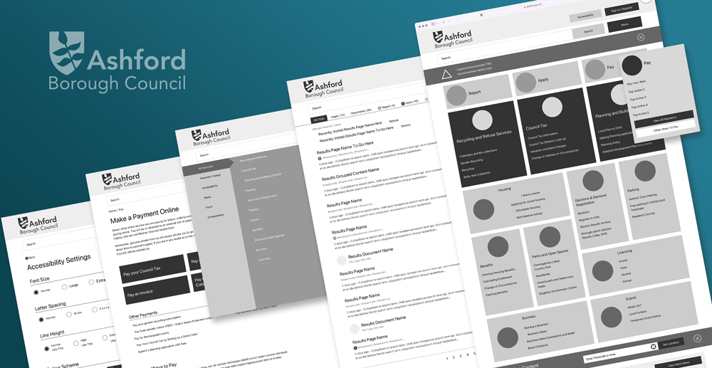
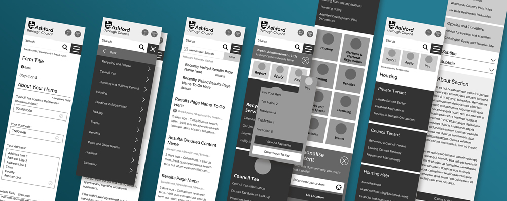
The implementation phase followed, with Visarc's UX and graphic design teams developing a range of wireframes and Invision mock-ups for the project. The design team placed particular focus on the homepage layout, search results pages as part of the design concept, with specific areas of mobile performance also a focus. Ashford Borough Council used these inputs to guide the redesign of its website. Many of the structural recommendations were implemented in the new version of the website including the improved search results pages and the homepage link hierarchies. An implementation plan was put together focussing on content first, ensuring users could get to the relevant material. This had the biggest impact. Styling updates to other aspects of the website are due to follow
Beyond the design process, the council's Google Analytics and Google Data Studio implementations were also upgraded to support cross-domain tracking. This enabled all form submissions to be tracked across 3 separate data processing platforms. This supported better visibility of underperforming departments and processes across the organisation and also facilitated long-term forecasting of demand and therefore staffing.
Cross-domain tracking has opened many doors to enable Ashford Borough Council to have an overview of their entire digital estate. This data has been used in conjunction with call centre data to calculate a digital uptake percentage. As a result, they now have a clearer picture of the proportion of customer contacts that are dealt with digitally versus phone calls and visits to the Civic Centre and can measure the success of their digital transformation work.
Many actual design projects require simple design solutions to solve the main challenges. This was very much true with the Ashford Borough Council website. Whilst we wanted to give it as much polish and visual impact as possible, it was the fundamental structural content changes that made the most telling contribution to the project overall.
andrew ockenden, senior account director at Visarc

result
The final phase of the project was dubbed Report and Measure. After the initial launch of Ashford Borough Council's new website, the local authority activated an ongoing product development process which was supported by regular post launch analysis from Visarc's digital marketing team. This revealed that after the upgrades:
- 48% of the top one hundred pages could be accessed in one click from the homepage, a far better transactional customer journey
- 33% reduction in usage of the search feature on the homepages indicating improved content discovery above the fold was reducing reliance on search
- 19.8% more customer service requests were handled by the website
Internal user testing and feedback regarding the project was unanimous and positive across departments
get in touch
get in touch with us and discuss your next project
